When We Were Sisters: Anatomy of a Book Cover
Pssst. . . Publishers and authors don’t always agree on book covers.
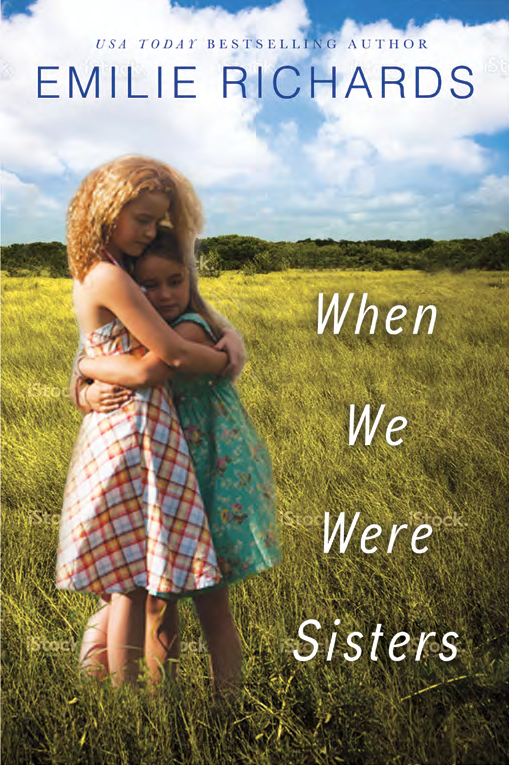
THIS MOCK UP COVER WAS MY FAVORITE AND THE PHOTO NOW GRACES THE BACK COVER.
You’re not surprised, are you? As a reader you may even have strong feelings about a book cover in your collection.
Maybe you have a preference for an icon cover (an object that relates to the book, like a pearl necklace or a Japanese lantern.) A clinch (two people in positions ranging from chaste to compromising.) Your favorites might be characters in action, or in repose, pictures of scenery, houses, horses. You might prefer pastels or jewel tones or even black and white.
And yes, readers sometimes refuse to pick up a book if they don’t like the cover. Ask me how I know? I’ve been there. I’ve even bought books solely because of their covers. It happens to the best of us.
So what’s behind book cover choices?
Let’s be honest here. Publishers usually pay more attention to what’s selling than to artistic imagination and merit. Wild experiments are often failures. A story circulated years ago about the covers of gothic novels, which were nearly always shades of blue. A weary publisher tried a green book cover, and the book sales tanked. They pulled the book and reissued the same cover in blue. Book sales boomed.
Ever wonder why so many book covers in your favorite genres look alike? That’s easy. Publishers know that readers have limited time. Clues are required. Romantic poses indicate a love story. Horses and ten gallon hats, a western. Dark, moody scenery probably foretells a thriller or mystery.
Where does the author fit in, or does she?
I am always asked for my ideas before covers are designed. Quite honestly my ideas are rarely used. In fact most of the time my input seems to matter most at the end, when I dig in my heels and request revisions on their ideas. I suspect there’s a dartboard somewhere in Toronto or New York with my picture on it. I understand. But a book cover like a title (you remember all those title blogs I’ve written?) matters to me. A lot.
In all fairness, I am not an artist. I envision things that are impossible, or silly in execution, or even unattractive. Not always, mind you, but sometimes. And it’s not my job to know what’s selling best at the moment. For this I need my publisher.
Part of the cover process includes telling the story so the cover will accurately reflect the book. Then after paragraphs of description of scenes and characters, I’m allowed to explain what I’d like to see. So what did I want for When We Were Sisters, arriving at bookstores in June?
When We Were Sisters, the good, the bad and the ugly.
Tomorrow, I’ll tell you my part of this story. But even more fun? The art department at Harlequin Mira will be blogging about my cover, and about a unique approach to finding a look and a depiction we could all agree on. I’m so delighted they’re doing this because you’ll enjoy this special and unusual peek. They will take you behind a cover shoot using the two little girls on the cover. (The photo above was my favorite and ended up on the back cover.)
I’ll tell you more about that decision tomorrow. But you’ll see other photos from the shoot and read the story from the art department’s perspective.
You’ll find the art department’s link here, tomorrow at noon, EST. And mine will go up here at the same time.
So come back at noon tomorrow, when I’ll tell you more about how the cover came to be, from my perspective, and you can then hop over and view the art department’s version. This is a unique opportunity and I thank my publisher for sharing the process with me and especially, with you.
Enjoy, and let me know what you think about the cover, the process and the final results.
I think the cover is perfect. It does a wonderful job reflecting what is in the book. Even the curly hair is appropriate.
While I liked the cover when I first saw the book, I really liked it after reading the book and realizing how closely aligned the cover is to the story.
Penny, since you’ve read it with my Krewe of Review, this is especially nice to hear. And yes, everyone worked hard to get these images. Read more tomorrow and see the candid photos from the shoot.
So interesting – thank you for sharing 🙂
I am very interested in this process from 2 perspectives… One as an educator and the other as the mom of one of the little girls on the cover 🙂 I love both pictures so far but I find the one with the girls facing away as a little more mysterious and reflective so waiting to read the book to decide on which one best fits! Exciting!
Tara, so wonderful to hear from you! I loved both these little girls on sight and asked for them both–and got them. I hope you’ll enjoy the book and give your opinion on the cover photo when you’re finished. I’ll confess that as I polled friends, many preferred the one Mira used and not the one I loved so well. But in the end, I got them both. Lucky me. Hug that daughter for me, okay?
Thank you! Being the momma I love both pictures but the educator in me is so curious to read and see why one was selected as the cover over the other. Mena (little red head) loved the whole experience! We were so happy to be a part of it.
I knew Mena had to be Cecilia the moment I saw her. Both girls were absolutely perfect. I can’t wait for my readers to see the candid photo shoot pictures. I’m so glad Mena enjoyed being a part of that day.
I have to say that I do like your cover also. It just kind of bums me out that you can’t choose the cover you want and that it’s up to the publisher. Seeing you put in all the hard work writing the novel, you should be able to pick the cover you like. To me, covers are basically what sell the book, but maybe that’s just me. Anyway, with a well-known author such as yourself, if it had your name on the cover and nothing else but the title, I’d still want to read it. Maybe it’s more of an angst for unknowns to not having total control over what cover they want. But so far, all yours have been awesome
I can’t wait till tomorrow. I’ll have to admit I do pay attention to covers. I’m even more interested now that one of my sons is a Graphic Designer. I’ll also admit that it really irks me if the cover is wrong–if the female character is a brunette and the one on the cover is a blonde, or if the dog in the book is a shepherd and the one on the cover is a poodle. I’ve read the ARC, and your cover is perfect!
This look into how a cover is born is so exciting to me! I love this back cover – it fits! Now my imagination is trying to picture the front cover. I can’t wait to find out more tomorrow! Thank you Emilie and the art department at Harlequin Mira! I also thank the precious girls that were chosen – way to go, Tara!