When We Were Sisters: Cover Shoot and Compromises
Sometimes it really does take a village. . .
Yesterday I told you a bit of the “science” behind covers, as well as the part authors play or don’t play in the conception and finalization. Today, a bit about the cover of When We Were Sisters and what an author, art department, editorial, marketing and various other players did to get there.
Really, shouldn’t this be simple? It’s what, a photo, your name and a title. How hard is that?
I liked the movement in this one, although as I say here I’m not happy with backs turned in general.
Before I go even a sentence further, I do need to admit that now that I’m self-publishing my backlist with new covers, I better understand the problems with getting a cover exactly right. At the moment, my cover designer and I are going over and over ideas for a book I wrote years ago. Unfortunately some of my ideas made scrunch-your-face-in-horror covers. Others were boring or confusing. We’re still working.
I loved the way this child took up the cover. I needed two girls, but I sent this to show more child, less scenery.
Luckily when the time came to create a cover for When We Were Sisters, everyone seemed in agreement. When We Were Sisters is the story of two foster sisters, Robin and Cecilia, reaching back into their past as they film a documentary on the foster care system. My job was to convey that story and the appearance of the characters to the art department.
While I sent in sample stock art for my characters as they appear in the novel, I also sent photos of them as children. In addition I sent covers of bestselling novels picturing children. (Two of those appear here.) I also sent photos with poses I liked, and stock art with no characters that depicted some other aspect of the story.
My editor thought children were the best idea, and I agreed. We were on our way.

Using a stock photo comp I did a quickie mock-up of how my idea might look.
The author tries to become a cover artist.
As I waited for the cover to unfold I found a photo I particularly liked. And since Robin is a photographer, my editor and I liked the idea of creating a Polaroid version for the front cover, like a photo she might have shot in the 1980s. Then perhaps another crisper photo of the two as grown women on the back. I made a crude mock-up to send along.
The art department didn’t buy my idea. But they, too, liked the idea of children on the cover. A step in the right direction.
We were making progress. Months went by and then I got my first look at the sample cover. I would love to say I was thrilled, but I wasn’t. In fact I was terrified. And yes, literally, because my first thought was that I needed to dive into my computer and pull those two unfortunate girls to safety. The little girls were holding hands and walking into smoke, or clouds. One author friend asked me if this was a book about two little girls in the after-life. Another asked if I was writing horror.
I’ll digress just a bit. Most of my covers lately (seven + in fact) have had women with their backs turned to the camera. I am tired of them. A man on Twitter called them the “White women facing backwards” covers, bless him. I hoped that since we were using children, we would see faces or at least parts of faces.
Authors and publishers don’t always agree. Nobody with a say–and lots of people are involved in creating cover art–had my concerns. They were convinced this was the right cover. I was equally convinced none of my readers would pick it up. I needed a cover that radiated the love between these little girls, love that carried them into adulthood and never wavered. My publisher wanted to express the difficulties of growing up in foster care.
That moment in which the artists and the novelist find common ground in a cover shoot. . .
After much head-banging and many passionate emails I got a welcome surprise. The art department decided to do an actual cover shoot for When We Were Sisters. They had stopped looking for stock photos (photos from sites like iStock, Shutterstock, etc.) and agreed to ditch the photo that was keeping me up nights. They were going to go out in the field, find models, dress them appropriately and take photos for the cover.
Glory hallelujah!
These days a cover shoot is unusual. Did my publisher know that 2015 was my thirtieth anniversary of writing for them? Probably not, but a cover shoot for what I thought was a special book, felt like a gift. We were going to get the right cover after all!
Let me point out that you can see actual candid photos of that day right here, so I won’t include them. Go to that link for a honest to goodness sneak peek at a real cover shoot. You’ll be delighted you took the time.

Some of the dresses I was asked to choose from.
The fun began immediately. I was to be included in choices. Was it: A) The griping? B) The anniversary? C) Sheer goodwill?
I decided it was “C.” They wanted me to be happy. I received photos of clothing, models, scenery, poses. Nobody promised all my choices would be used, but they said they would do their best. Robin and Cecilia were children in the 1980s, so I had fun looking at styles of that decade. I chose several dresses for each girl from the many possibilities I was offered, and the girls on the cover showed up wearing them. I chose the models, too, and gave input into the scenery.
Logistics and pesky details. . .
How does an art department in Canada take photos of little girls in Florida? Well, Cecilia and Robin lived in central Florida in ranching country, and fields would be appropriate, as would woods. We didn’t need beaches or palm trees, and the clever people in charge found locations that worked. They took a selection of photos and created mock-ups using several of them.
Yesterday I showed you one. As I said then, that shot was my favorite by far because I believed it best told the story. At that point nobody but me had seen the finished manuscript, so I felt I had an edge. Imagine my surprise, though, when I received their preference, a cover almost exactly like the one I had disliked so strongly, only with girls who looked like my characters. They really were convinced the girls walking into danger was appropriate for the story. The cover was mostly black, white and gray and yes, I was not happy.
Compromise and consensus. If politicians would only learn from our example.
The world runs better with compromise and consensus. We all knew that. Once again I told them how wrong I felt this cover was. All that trouble, all those gorgeous photos of the little girls, and once again we were seeing backs. And worst of all, my readers would be afraid to pick up the book.
But wait! This is a story with a happy ending, so keep reading. The next version I saw was the final one. The art department kept the pose they’d been set on, but everything else changed. The colors, the feeling, and a blue sky with billowing white clouds ahead.
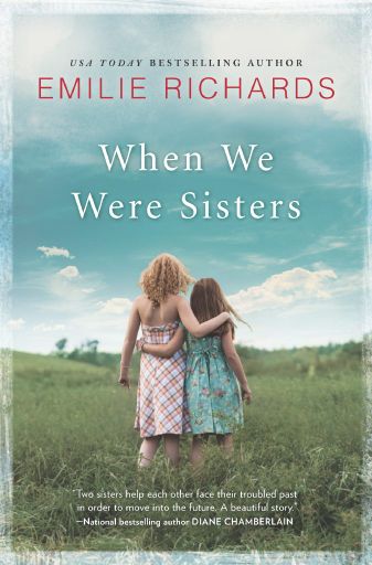
Our final cover graced by a Diane Chamberlain quote. I couldn’t be happier.
Here’s what I wrote my editor when I saw it:
“I think it’s gorgeous! I think it’s perfect. I think you really tried to please me and absolutely did. This says everything about the book while still making it clear they’re looking toward the future–or as much as a photo might. I am just delighted. Thank you both, thanks to everyone on the team for taking a second look (possibly third and fourth) and tweaking, for making this a cover that will tell the story and, I strongly believe, sell the book!”
Effusive much? Who cares? I meant it.
Did you know a cover took this much time, this many people, and a little heartache? But not only did I appreciate the final version, the art department took my editor’s suggestion and put the photo of the girls hugging on the back.
Once again, enjoy a sneak peek and candid shots of the shoot right here.
Thanks so much for reading along. This was a fun post to share. I’m enjoying yesterday’s comments, including two from one of the young models’ mom! Let me know your thoughts, too.
And stay tuned for more special content as launch date approaches, including something wonderfully musical (Cecilia is an internationally known singer-songwriter) and behind the scenes glimpses of my characters.
To preorder When We Were Sisters:
Amazon, iBooks, Barnes and Noble, Books A Million, Kobo as well as your favorite independent bookstore. The book will be published in hardcover, paperback and ebook versions, so choose your favorite way to read.
(I am an affiliate of Amazon and iBooks but encourage you to buy wherever you most enjoy shopping, and local is always good.)
To me a cover is really important. I love “I was not happy”. Covers a lot I suspect. Like you a cover will draw me into a book I never would have read, or possibly make me stay away from it. Some books I rue the fact it has such a bad cover that it will put readers off and I know it is so good inside. I hate when a book does not match a cover, like a summer beach scene when the book is set in the hills of England! I also hate a cover of an up and coming cover for a much loved author, (not yours) most people love it, I think it is tawdry. But I’ll read it because I would never miss one of her books. I love how you had involvement and hung out for what you wanted.
That much involvement is unusual, but the art dept. and my publisher in general really did listen and try to reach compromise.
It is so interesting what you go through getting a cover. I love the scenes with the two little girls in your above cover. I think this one is spot on!
I’m very happy, especially that they used the photo of the girls hugging on the back. This way we both got the photo we loved best.
I love reading your books and long ago preordered “When We Were Sisters” before there was even a cover made. I am looking forward to reading the book and absolutely love the cover that was chosen.
I admire you for waiting it out and being happy with the final result. I think I would have thrown in the towel early on.
It’s a beautiful cover. I learn something new everyday and this was today’s new thing. I never realized how much work went into choosing a cover picture.
I’m sure I’m going to enjoy this book, just like your others.
I enjoyed reading about the process of creating a book cover. It is so important to draw readers in. Even on ebooks, I always go back and look at the covers. I am looking forward to this one, Emilie.
I’m delighted, Janet. I think you’ll enjoy it.
I connected with the photo when I saw it, and I realize why, now. I grew up in the part of Ontario where those pictures were taken. You took me home!
I am glad you got some input into the cover. I can’t tell you how many times I have finished a book and realized that the person who chose the cover art never read the book.
That’s a kick. The background is universal enough to serve as Florida and Ontario. Who’d have thought?